At Oslandia, we like working with Open Source tool projects and handling Open (geospatial) Data. In this article series, we will play with the OpenStreetMap (OSM) map and subsequent data. Here comes the seventh article of this series, dedicated to user classification using the power of machine learning algorithms.
1 Develop a Principle Component Analysis (PCA)
From now we can try to add some intelligence into the data by using well-known machine learning tools.
Reduce the dimensionality of a problem often appears as a unavoidable pre-requisite before undertaking any classification effort. As developed in the previous blog post, we have 40 normalized variables. That seems quite small for implementing a PCA (we could apply directly a clustering algorithm on our normalized data); however for a sake of clarity regarding result interpretation, we decide to add this step into the analysis.
1.1 PCA design
Summarize the complete user table by just a few synthetic components is appealing; however you certainly want to ask “how many components?”! The principle component analysis is a linear projection of individuals on a smaller dimension space. It provides uncorrelated components, dropping redundant information given by subsets of the initial dataset.
Actually there is no ideal component number, it can depend on modeller wishes; however in general this quantity is chosen according to the explained variance proportion, and/or according to eigen values of components. There are some rules of thumbs for such a situation: we can choose to take components to cover at least 70% of the variance, or to consider components with a larger-than-1 eigen value.
cov_mat = np.cov(X.T)
eig_vals, eig_vecs = np.linalg.eig(cov_mat)
eig_vals = sorted(eig_vals, reverse=True)
tot = sum(eig_vals)
varexp = [(i/tot)*100 for i in eig_vals]
cumvarexp = np.cumsum(varexp)
varmat = pd.DataFrame({'eig': eig_vals,
                       'varexp': varexp,
                       'cumvar': cumvarexp})[['eig','varexp','cumvar']]
f, ax = plt.subplots(1, 2, figsize=(12,6))
ax[0].bar(range(1,1+len(varmat)), varmat['varexp'].values, alpha=0.25,
        align='center', label='individual explained variance', color = 'g')
ax[0].step(range(1,1+len(varmat)), varmat['cumvar'].values, where='mid',
         label='cumulative explained variance')
ax[0].axhline(70, color="blue", linestyle="dotted")
ax[0].legend(loc='best')
ax[1].bar(range(1,1+len(varmat)), varmat['eig'].values, alpha=0.25,
          align='center', label='eigenvalues', color='r')
ax[1].axhline(1, color="red", linestyle="dotted")
ax[1].legend(loc="best")
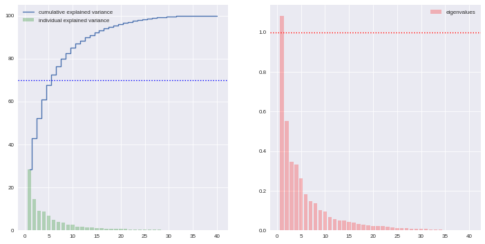
Here the second rule of thumb fails, as we do not use a standard scaling process (e.g. less mean, divided by standard deviation), however the first one makes us consider 6 components (that explain around 72% of the total variance). The exact figures can be checked in the varmat data frame:
varmat.head(6)
        eig     varexp     cumvar
0  1.084392  28.527196  28.527196
1  0.551519  14.508857  43.036053
2  0.346005   9.102373  52.138426
3  0.331242   8.714022  60.852448
4  0.261060   6.867738  67.720186
5  0.181339   4.770501  72.490687
1.2 PCA running
The PCA algorithm is loaded from a sklearn module, we just have to run it by giving a number of components as a parameter, and to apply the fit_transform procedure to get the new linear projection. Moreover the contribution of each feature to the new components is straightforwardly accessible with the sklearn API.
from sklearn.decomposition import PCA
model = PCA(n_components=6)
Xpca = model.fit_transform(X)
pca_cols = ['PC' + str(i+1) for i in range(6)]
pca_ind = pd.DataFrame(Xpca, columns=pca_cols, index=user_md.index)
pca_var = pd.DataFrame(model.components_, index=pca_cols,
                       columns=user_md.columns).T
pca_ind.query("uid == 24664").T
uid     24664
PC1 -0.358475
PC2  1.671157
PC3  0.121600
PC4 -0.139412
PC5 -0.983175
PC6  0.409832
Oh yeah, after running the PCA, the information about the user is summarized with these 6 cryptic values. I’m pretty sure you want to know which meaning these 6 components have…
1.3 Component interpretation
By taking advantage of seaborn (a Python visualization library based on Matplotlib), we can plot the feature contributions to each component. All these contributions are comprised between -1 (a strong negative contribution) and 1 (a strong positive contribution). Additionnally there is a mathematical link between all contributions to a given component: the sum of squares equals to 1! As a consequence the features can be ranked by order of importance in the component definition.
f, ax = plt.subplots(figsize=(12,12))
sns.heatmap(pca_var, annot=True, fmt='.3f', ax=ax)
plt.yticks(rotation=0)
plt.tight_layout()
sns.set_context('paper')
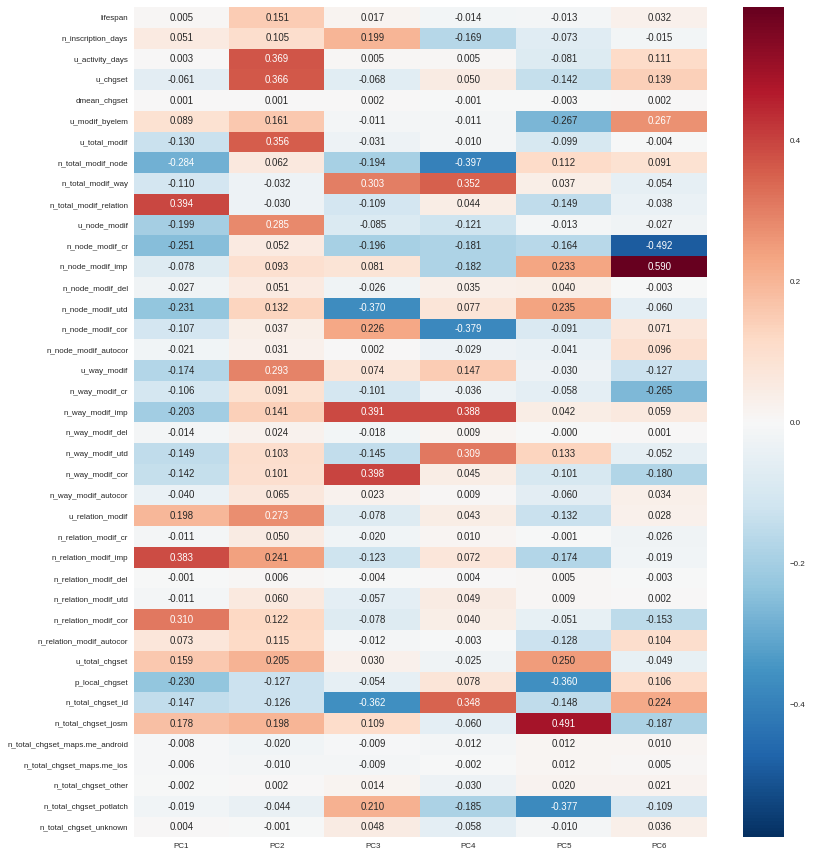
Here our six components may be described as follows:
- PC1 (28.5% of total variance) is really impacted by relation modifications, this component will be high if user did a lot of relation improvements (and very few node and way modifications), and if these improvements have been corrected by other users since. It is the sign of a specialization on complex structures. This component also refers to contributions from foreign users (i.e. not from the area of interest, here the Bordeaux area), familiar with JOSM.
- PC2 (14.5% of total variance) characterizes how experienced and versatile are users: this component will be high for users with a high number of activity days, a lot of local as well as total changesets, and high numbers of node, way and relation modifications. This second component highlights JOSM too.
- PC3 (9.1% of total variance) describes way-focused contributions by old users (but not really productive since their inscription). A high value is synonymous of corrected contributions, however that’s quite mechanical: if you contributed a long time ago, your modifications would probably not be up-to-date any more. This component highlights Potlatch and JOSM as the most used editors.
- PC4 (8.7% of total variance) looks like PC3, in the sense that it is strongly correlated with way modifications. However it will concern newer users: a more recent inscription date, contributions that are less corrected, and more often up-to-date. As the preferred editor, this component is associated with iD.
- PC5 (6.9% of total variance) refers to a node specialization, from very productive users. The associated modifications are overall improvements that are still up-to-date. However, PC5 is linked with users that are not at ease in our area of interest, even if they produced a lot of changesets elsewhere. JOSM is clearly the corresponding editor.
- PC6 (4.8% of total variance) is strongly impacted by node improvements, by opposition to node creations (a similar behavior tends to emerge for ways). This less important component highlights local specialists: a fairly high quantity of local changesets, but a small total changeset quantity. Like for PC4, the editor used for such contributions is iD.
1.4 Describe individuals positioning after dimensionality reduction
As a recall, we can print the previous user characteristics:
pca_ind.query("uid == 24664").T
uid     24664
PC1 -0.358475
PC2  1.671157
PC3  0.121600
PC4 -0.139412
PC5 -0.983175
PC6  0.409832
From the previous lightings, we can conclude that this user is really experienced (high value of PC2), even if this experience tends to be local (high negative value for PC5). The fairly good value for PC6 enforces the hypothesis credibility.
From the different component values, we can imagine that the user is versatile; there is no strong trend to characterize its specialty. The node creation activity seems high, even if the last component shades a bit the conclusion.
Regarding the editors this contributor used, the answer is quite hard to provide only by considering the six components! JOSM is favored by PC2, but handicaped by PC1 and PC5; that is the contrary with iD; Potlatch is the best candidate as it is favored by PC3, PC4 and PC5.
By the way, this interpretation exercise may look quite abstract, but just consider the description at the beginning of the post, and compare it with this interpretation… It is not so bad, isn’t it?
2 Cluster the user starting from their past activity
At this point, we have a set of active users (those who have contributed to the focused area). We propose now to classify each of them without any knowledge on their identity or experience with geospatial data or OSM API, by the way of unsupervised learning. Indeed we will design clusters with the k-means algorithm, and the only inputs we have are the synthetic dimensions given by the previous PCA.
2.1 k-means design: how many cluster may we expect from the OSM metadata?
Like for the PCA, the k-means algorithm is characterized by a parameter that we must tune, i.e. the cluster number.
from sklearn.cluster import KMeans
from sklearn.metrics import silhouette_score

scores = []
silhouette = []
for i in range(1, 11):
    model = KMeans(n_clusters=i, n_init=100, max_iter=1000)
    Xclust = model.fit_predict(Xpca)
    scores.append(model.inertia_)
    if i == 1:
        continue
    else:
        silhouette.append(silhouette_score(X=Xpca, labels=Xclust))

f, ax = plt.subplots(1, 2, figsize=(12,6))
ax[0].plot(range(1,11), scores, linewidth=3)
ax[0].set_xlabel("Number of clusters")
ax[0].set_ylabel("Unexplained variance")
ax[1].plot(range(2,11), silhouette, linewidth=3, color='g')
ax[1].set_xlabel("Number of clusters")
ax[1].set_ylabel("Silhouette")
ax[1].set_xlim(1, 10)
ax[1].set_ylim(0.2, 0.5)
plt.tight_layout()
sns.set_context('paper')
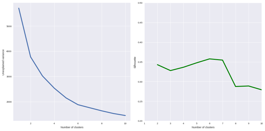
How many clusters can be identified? We only have access to soft recommendations given by state-of-the-art procedures. As an illustration here, we use elbow method, and clustering silhouette.
The former represents the intra-cluster variance, i.e. the sparsity of observations within clusters. It obviously decreases when the cluster number increases. To keep the model simple and do not overfit the data, this quantity has to be as small as possible. That’s why we evoke an “elbow”: we are looking for a bending point designing a drop of the explained variance marginal gain.
The latter is a synthetic metric that indicates how well each individuals is represented by its cluster. It is comprised between 0 (bad clustering representation) and 1 (perfect clustering).
The first criterion suggests to take either 2 or 6 clusters, whilst the second criterion is larger with 6 or 7 clusters. We then decide to take on 6 clusters.
2.2 k-means running: OSM contributor classification
We hypothesized that several kinds of users would have been highlighted by the clustering process. How to interpret the six chosen clusters starting from the Bordeaux area dataset?
model = KMeans(n_clusters=6, n_init=100, max_iter=1000)
kmeans_ind = pca_ind.copy()
kmeans_ind['Xclust'] = model.fit_predict(pca_ind.values)
kmeans_centroids = pd.DataFrame(model.cluster_centers_,
                                columns=pca_ind.columns)
kmeans_centroids['n_individuals'] = (kmeans_ind
                                     .groupby('Xclust')
                                     .count())['PC1']
kmeans_centroids
        PC1       PC2       PC3       PC4       PC5       PC6  n_individuals
0 -0.109548  1.321479  0.081620  0.010547  0.117813 -0.024774            317
1  1.509024 -0.137856 -0.142927  0.032830 -0.120925 -0.031677            585
2 -0.451754 -0.681200 -0.269514 -0.763636  0.258083  0.254124            318
3 -0.901269  0.034718  0.594161 -0.395605 -0.323108 -0.167279            272
4 -1.077956  0.027944 -0.595763  0.365220 -0.005816 -0.022345            353
5 -0.345311 -0.618198  0.842705  0.872673  0.180977 -0.004558            228
The k-means algorithm makes six relatively well-balanced groups (the group 1 is larger than the others, however the difference is not so high):
- Group 0 (15.3% of users): this cluster represents most experienced and versatile users. The users are seen as OSM key contributors.
- Group 1 (28.2% of users): this group refers to relation specialists, users that are fairly productive on OSM.
- Group 2 (15.3% of users): this cluster gathers very unexperienced users, that comes just a few times on OSM to modify mostly nodes.
- Group 3 (13.2% of users): this category refers to old one-shot contributors, mainly interested in way modifications.
- Group 4 (17.0% of users): this cluster of user is very close to the previous one, the difference being the more recent period during which they have contributed.
- Group 5 (11.0% of users): this last user cluster contains contributors that are locally unexperienced, they have proposed mainly way modifications.
To complete this overview, we can plot individuals according to their group:
SUBPLOT_LAYERS = pd.DataFrame({'x':[0,2,4],
                               'y':[1,3,5]})
f, ax = plt.subplots(1, 3, figsize=(12,4))
for i in range(3):
    ax_ = ax[i]
    comp = SUBPLOT_LAYERS.iloc[i][['x', 'y']]
    x_column = 'PC'+str(1+comp[0])
    y_column = 'PC'+str(1+comp[1])
    for name, group in kmeans_ind.groupby('Xclust'):
        ax_.plot(group[x_column], group[y_column], marker='.',
                 linestyle='', ms=10, label=name)
        if i == 0:
            ax_.legend(loc=0)
    ax_.plot(kmeans_centroids[[x_column]],
             kmeans_centroids[[y_column]],
             'kD', markersize=10)
    for i, point in kmeans_centroids.iterrows():
        ax_.text(point[x_column]-0.2, point[y_column]-0.2,
                 ('C'+str(i)+' (n='
                  +str(int(point['n_individuals']))+')'),
                  weight='bold', fontsize=14)
    ax_.set_xlabel(x_column + ' ({:.2f}%)'.format(varexp[comp[0]]))
    ax_.set_ylabel(y_column + ' ({:.2f}%)'.format(varexp[comp[1]]))
plt.tight_layout()
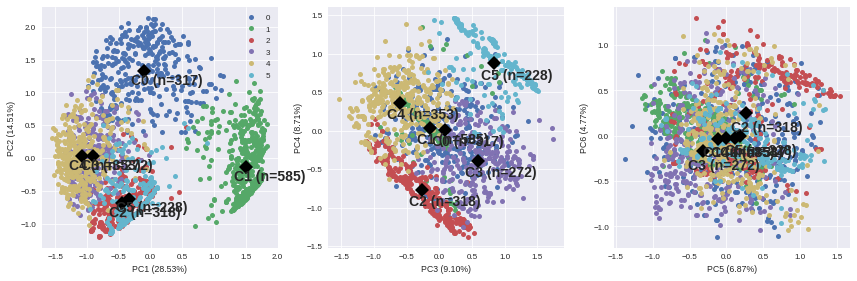
It appears that the first two components allow to discriminate clearly C0 and C1. We need the third and the fourth components to differentiate C2 and C5 on the first hand, and C3 and C4 on the other hand. The last two components do not provide any additional information.
3 Conclusion
“Voilà”! We have proposed here a user classification, without any preliminar knowledge about who they are, and which skills they have. That’s an illustration of the power of unsupervised learning; we will try to apply this clustering in OSM data quality assessment in a next blog post, dedicated to mapping!

